Lululemon

PROJECT DETAILS/
E-commerce Design
UI Design
Interaction Design
Prototyping
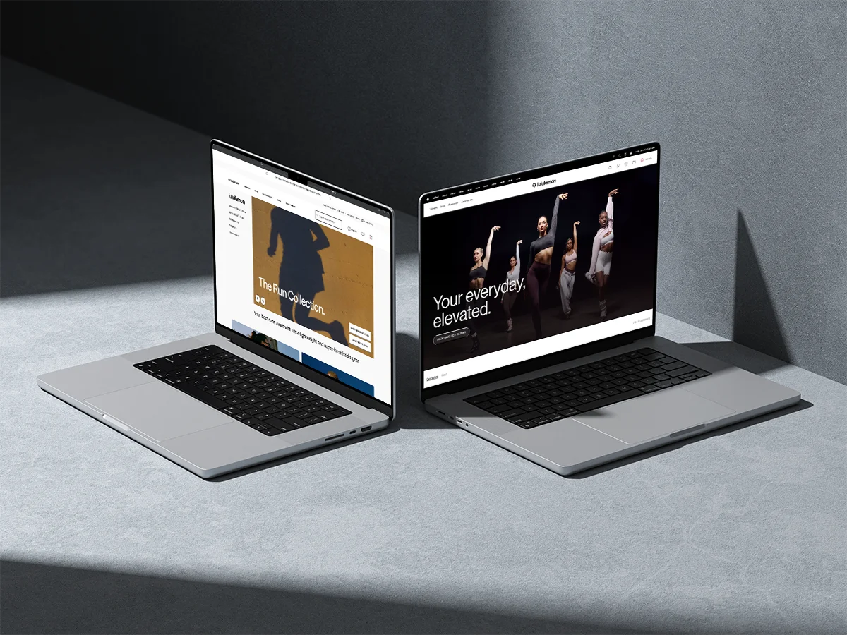
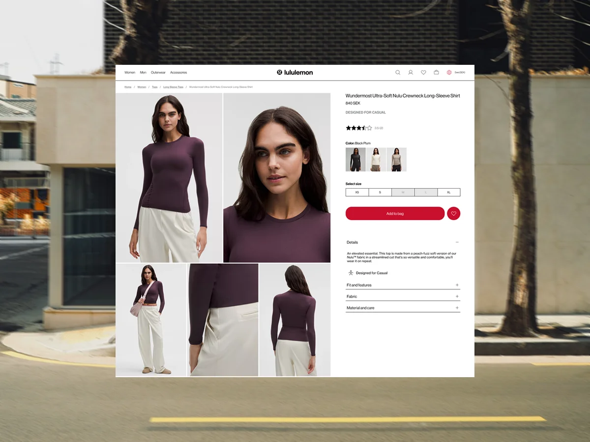
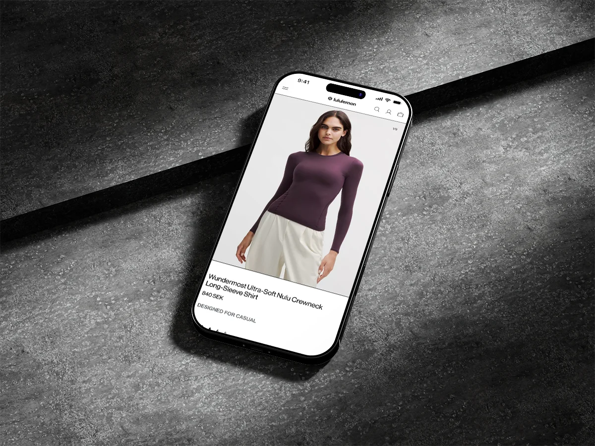
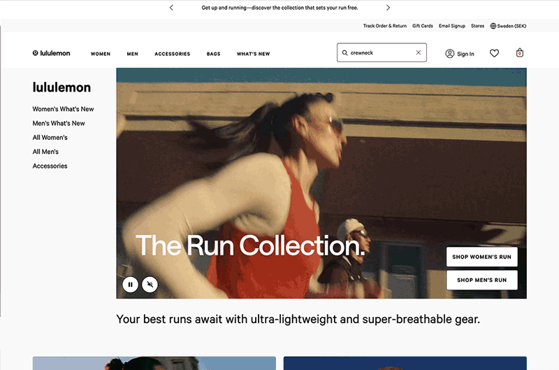
Lululemon's EU site doesn't match what the brand actually charges for its products. The EU site had the right imagery and the right products. What it didn't have was a clear path through them. This re-design worked strictly within Lululemon's existing visual identity, same colours, same typography, same photography. The decisions were structural: one hero, one CTA, a navigation that doesn't compete with the product, and a product page where Add to Bag is the obvious next step. The brand was already premium. The interface just needed to act like it.
"The product was premium. The interface wasn't. That gap was the brief."
Client
Lululemon
Year
2025
Type
School Project
Next Project
